Disclaimer: SimsVIP, WhipperWhirl, and Wee Albet are not responsible for any side-effects of using this review. Side-effects include, but are not limited to, squealing, dancing for joy, wondering if the reviewer is nuts, random laughter, uncontrollable grinning, and spontaneous human sublimation. Side effects mild and same as sugar pill. Please consult your metaphysicist before use.
First Impressions
Admittedly, at first I was very, very leery of this world. Not because of the decor, but because of the fact it’s marketed as a city world and I still remember how many problems Bridgeport caused (and still causes) for me. While I would love to use Bridgeport as a play world, not even the mods I have solved enough of Bridgeport’s problems for that world to be usable for me. I was not excited at a potential repeat of that experience.
The decor and clothes, on the other hand, have me grinning. They remind me of the old mobster movies. So much so, in fact, that I kept confusing this world for a 1950s theme at first. I’ve seen way, way too many 1950s mobster movies. I can’t stop grinning at the ideas related to it. I keep imagining a fairy mobster doing a drive-by pranking of a witch FBI agent before they get into a high speed car-and-broom chase down the highway, launching spells and alchemy potions at each other. All the while, an alien shakes down a simbot for protection money while his mermaid enforcer reminds the simbot it could easily go for a dip.
Okay, I admit it; I was having fun with this world without even playing it yet. So, I fitted my concerns over the city problems with a pair of cement shoes and decided to give the city a chance.
————————————————————————————————————————————-
Town Layout
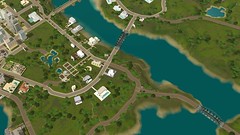
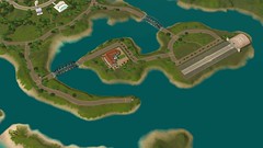
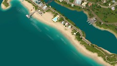
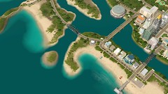
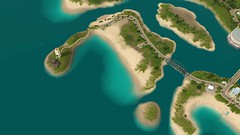
Roaring Heights is the third in a line of tropical or semi-tropical worlds, and like the others is a series of islands. Unlike the others, it keeps the islands connected via a set of bridges, allowing one to easily drive anywhere without dealing with a circular layout that can be confusing. Most of the city is located on the center island, with skyscrapers serving for many of the rabbit-hole careers and for other city staples such as a gym and art gallery. The other islands contain very little, with the city quickly fading to nothing as one gets further away from the city core. As such, the world itself can feel incredibly tiny in comparison to most worlds.
Sadly, city hall is not also the headquarters for the crime careers, despite how well it would have fit the theme of the world. Alas, it seems that combination sleeps with the fishes.
I am uncertain how much of the empty land out away from the town center is routable. However, I suspect a lot of it isn’t, so it may be safer to bulldoze lots closer to the city core for purposes of adding new lots.
Ultimately, this town feels too small to be a city. Instead, it feels like a tropical town with skyscrapers.
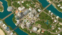
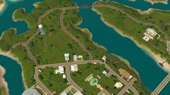
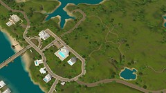

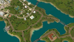
————————————————————————————————————————————-
Decor
The decor can be described with two words: art deco. That’s pretty much the entirety of the world’s design; every single aspect of it applies to that theme. Except the tropical setting; that just strikes me as completely bizarre. But, I am used to seeing art deco in places where winter tends to be heavy; seeing it in a tropical setting with skyscrapers that look, to me, to be designed for a place with heavy winters just strikes me as opposing themes.
I decided to start out first with the home my sims are living in. I needed to get an idea of what I was working with for this world.
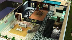
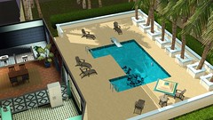
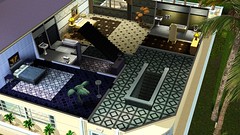
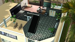
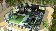
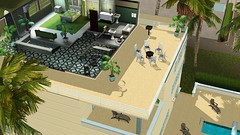
If you hear crying, it’s me mourning that kitchen right before I tell the boys to go have a “talk” with it. That is, quite possibly, the worst kitchen color scheme I have seen yet. However, the general design of the kitchen isn’t that bad, so it can be salvaged. I also hate the way the rest of the house is decorated and the lack of yard space, but those items can be a lot more easily worked around than a bad kitchen.
Okay, maybe I’m particular about my kitchens…
To be honest, the decoration of most of the house isn’t actually bad; it’s just not my taste. I’m not a big art deco fan when it comes to internal decorations; the inside of a house is where I live, after all, and it’s got to be comfortable for me. That said, the general design of the house gives massive amounts of room for converting to activity rooms, and actually doesn’t waste that much space. It would be easy to just redecorate this house and end up with a place that is well worth the effort.
But, I had to move on to the rest of the town, so…
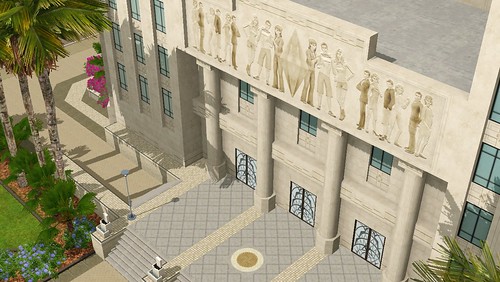
This shot is from the front of City Hall. I love the Sims 4 easter egg they hid on it! And this is one of the best-designed city halls they’ve made. The Store Team can consider themselves made men and women for this work!
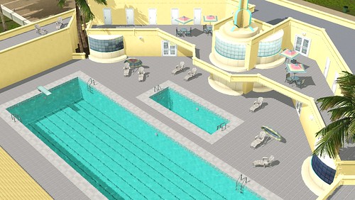
This is one of the pools in the city. I actually love how this one is designed; the color scheme is not that great, but recolored and this lot would fit in with a number of modern cities and work quite well. Notably, the color scheme is tropical, which doesn’t really fit as well with the other art deco buildings.
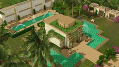
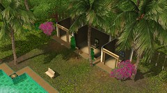
When thinking of cemeteries, you would expect a respectful place for people to be buried. Instead the style of the cemetery in Roaring Heights is more like something you would expect from a club. The ghosts want to spend eternity haunting the world, not getting on down and boogieing. (Special thanks to Wee Albet for that wording; it’s much, much better than what I was going to say.) Pretty much, this feels like they were originally going to place a tropical theme in this world, but realized they forgot to add a cemetery and converted it to that instead. It also is far too tropical to fit in with the rest of the art deco theme, and feels more like it would be better in Isla Paradiso than in this world and is one of the primary items that gives me a sense the art deco doesn’t actually fit the surroundings.
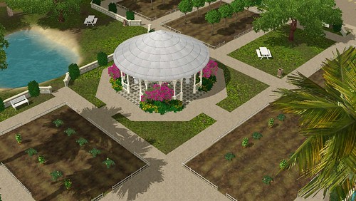
This is the first community that actually feels like a community garden to me! It is utterly lovely, and the entire design of it gives the feel of an organized community effort to actually grow some plants! Plus, the design of it also gives the idea people spend time here doing more than just gardening. It quite possibly is the best community lot ever produced.
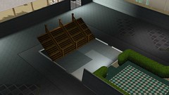
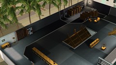
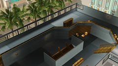
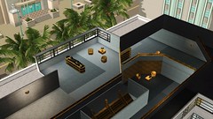
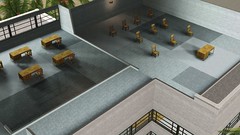
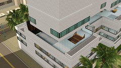
And this is the public library. The general emptiness of it in those pictures is not a misrepresentation; the library itself, for reasons that can only be bizarre, simply lacks books for all of the space it has. What bookshelves it has seem to be there mostly for thematic reasons and not for the actual purpose of serving as a library. Top it all off, this is one of the skyscraper buildings near the center of town; it is designed to come across as having space to spare, which makes the lack of using that space rather unusual. The last picture highlights one of the problems with how skyscrapers were handled for this particular town.
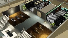
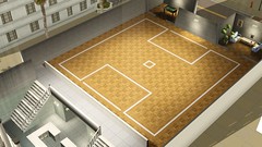
This is the gym closest to the center of the city (there’s another one a bit further out, mixed in with the clubs). It is a nicely-designed gym, and the top floor would work well if paired with the Rim Rockin’ Basketball Hoop.
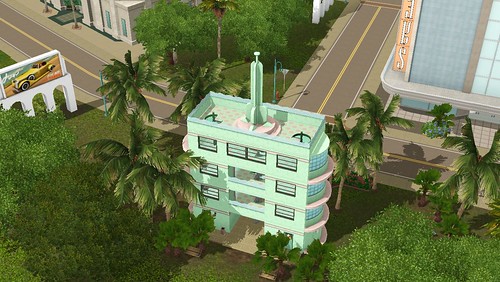
A small park near the center of town. I simply thought it was nice how they designed the building and added it to the park; it’s unusual to see this and I hope things like this are included in future worlds. Note the tropical theme to the coloring scheme.
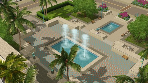
This is the central park for the world. And the one already converted into a festival lot (the festival lot is my next article). Overall, it shows one simple truth I have seen repeated since Sunset Valley: When they choose to make a very large park at the center of town, the result is inevitably gorgeous. This one combines tropical and temperate designs in a way that causes both to compliment and enhance each other. This is my favorite large park out of all of them.
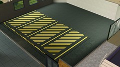

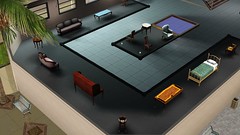
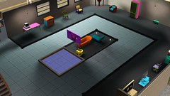
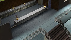
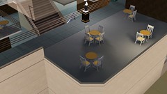
This is the downtown art building. It’s not the first time that furniture has been used as art in a Sims world; Barnacle Bay comes to mind as a good example of it happening. However, having it just be garishly colored as art… That confuses me. I’ll have to ask my artist friend about it sometime and see what she has to say. In any case, if all else fails, you can redecorate it with items from World Adventures. I included a picture of the parking spaces in case a reader wants to copy them for other worlds, or just needs to know where to position people for another Love Day Massacre.
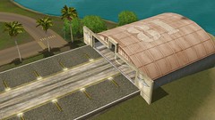
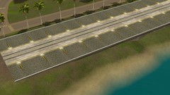
I don’t care that this takes up space that could have gone to more building room; it’s just that cool. That they would include a runway like this so close to the military base just fits it utterly, and gives you an idea of how people are getting in and out of Roaring Heights.
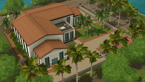
This is the military base itself. This is one of the times where I feel they took the art deco theme too far; the military base actually looks like a building that shouldn’t have any military in it at all. It doesn’t even look like it should have anything to do with aircraft. Is it a hotel for them to stay at?
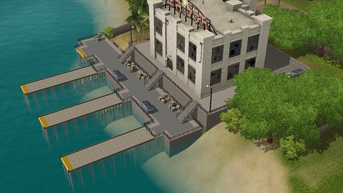
This is the criminal headquarters. The decision to use this kind of building for it is rather obvious; the Mafia once pretty much controlled the shipping unions for the United States. Why does the building look so run down? It actually looks out of place compared to the rest of the world with it being in such a state.
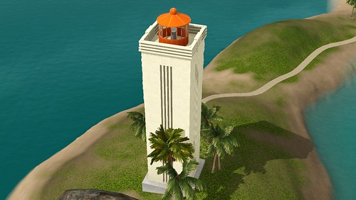
This is an incredibly lovely lighthouse! I was at first dubious of the ability of this one to withstand storms for long, up until I hit Google and discovered a similar lighthouse exists in Iceland.
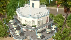
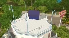
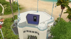
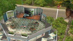
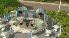
This is one of the many hangouts that are in Roaring Heights. The roof is a design decision that makes me scratch my head, but the rest of the building is actually very well designed. And sims that teleport or zeneport can reach the roof anyway, so it’s not necessarily useless space.
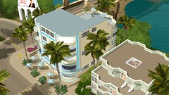
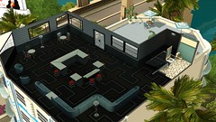
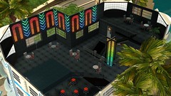
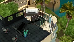
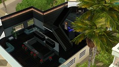
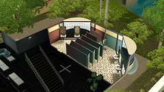
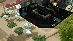
This is the hangout that surprised me the most. The dark interiors, without managing to be oppressively dark, ultimately lend an air of a place that is a nice club even a bit into modern-day without losing the feel of the era the town is going for.
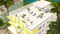
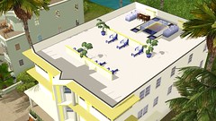
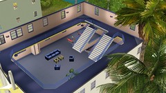
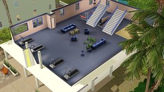
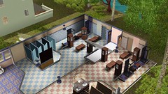
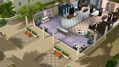
And this is the other gym in town. It has a much nicer color scheme than the first as well as more room, but lacks the setup for basketball. The outside of the building is also nicer, lacking the skyscraper feature that can irritate when taking screenshots.
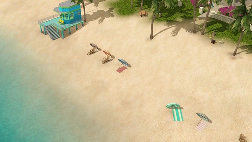
Ah, yes. The lovely beach! A bit of redecorating and you can add a lifeguard chair where the bench is to make certain there are lifeguards on duty. Just make certain the lifeguards are looking the other way when the latest victim of “spirited negotiations” learns to “scuba dive” while wearing concrete weights. It really is a lovely beach, and isolated enough most people won’t hear the cries for help…
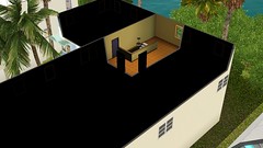
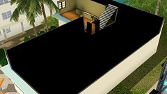
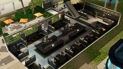
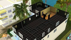
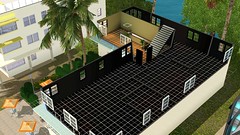
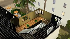
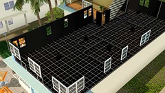
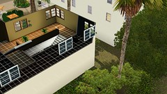
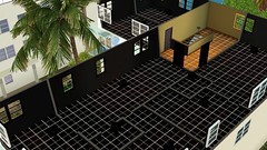
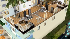
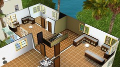
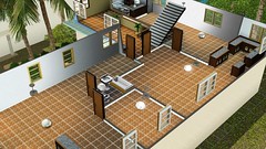
This lot, as you can tell, got me very curious. It is just another hangout, but I had to wonder why it had darkened rooms. Darkened rooms which did not respond to lights being placed in them. At finding out it’s an apartment building of sorts, it occurred to me that only a little work would turn this into an actual apartment building or even a resort. That is something to consider when looking at this building for personal use.
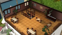
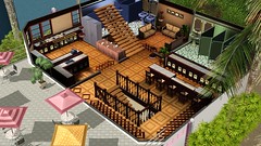
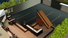
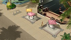
Yet another hangout, with the exception that this one has what I feel to be the most restaurant-like theme of the group. Add in certain items from the Store’s bistro venue and you can turn this into an active restaurant. Leave it as a hangout so people actually drop by.
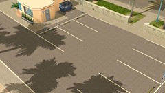
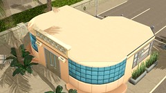
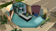
I honestly have no idea what point this lot serves. I guess it is parking for the people headed to the restaurant out on the boardwalk?
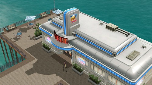
This restaurant is the one near the parking lot in the pictures just above. It’s a lovely restaurant! Very much in the theme of the period! And it’s a rabbithole lot.
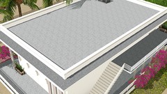
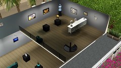
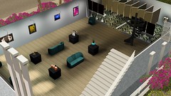
The other museum. This one seems to be mostly devoted to paintings, though. Not really as nice as the one in the middle of town, though.
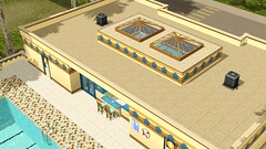
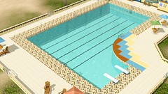
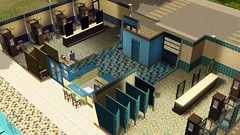
The other public pool. Not as nice as the main one found elsewhere, and the color scheme is not one I can look at without shuddering. Can be salvaged with a recolor. Strangely, it’s part of the tropical theme some of the buildings have.

I took a picture of these houses because of the tropical art deco theme that doesn’t quite fit with the skyscrapers in the center of town. It’s another piece of what makes me wonder if the art deco theme wasn’t tacked onto an unfinished tropical world.
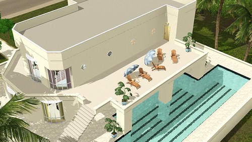
This is one of the other mansions you can buy in town, and in fact the one I considered buying first. Its main disadvantages, compared to the one I ended up with, are the lack of driveway and lack of internal space; otherwise, this mansion is a potential dream for those seeking to live a rich lifestyle on a medium-sized lot.
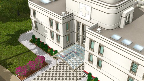
The hospital is incredibly well-designed, and could easily fit in a number of worlds even with its art deco architecture. The problem it has in Roaring Heights is location; from the city center, it’s among the list of buildings that are the farthest away. This means that a drive to it, compared to the rest of the town, can be incredibly long. It’s interesting to note that the medical care is so far away from the skyscrapers.
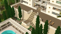
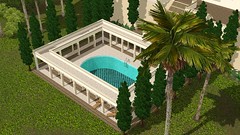
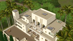
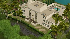
This is the biggest of the mansions. It’s also inhabited when you load the town; unless you’re willing to kick out an old man so you can steal his home from him, it likely will remain inhabited for awhile before your sim gets a chance to buy it. It also is incredibly roomy, making finally purchasing it worth the wait.
————————————————————————————————————————————-
CAS
Note for my artist friend: I am aware of the closed eyes. I am aware this has earned me a lecture on proper picture taking. I am aware this means I will have to see the 1000 Slides of Doom. Please stop glaring at me!
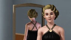

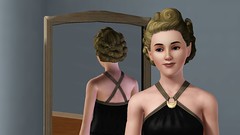
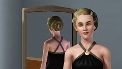

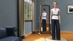
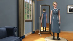
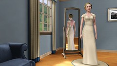
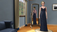
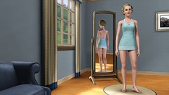
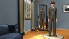
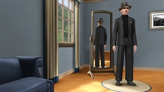
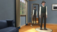
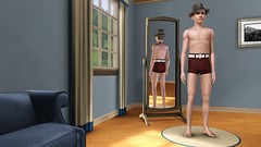
Note the hat in the male CAS pictures is part of this world.
Pretty much… the clothing fits the world. It’s not the best selection, but there are clothing sets already out which more than cover a good selection for this world’s theme. So, this is more wrapping the theme up than anything else.
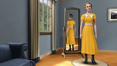
And, of course, there is also the Boardwalk Attire clothing:
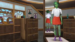
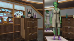
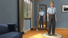
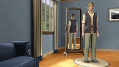
Overall, all of the clothing fits the theme. And it’s lovely, within that theme.
————————————————————————————————————————————-
Auto Repairs
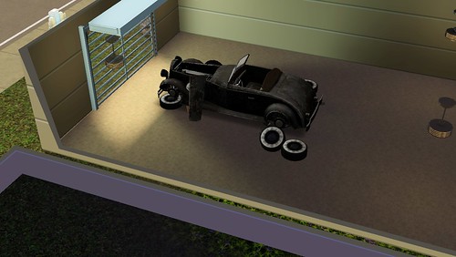
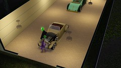
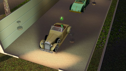
That broken-down piece of junk is the new piece of premium content that Roaring Heights comes with. Luckily, you can turn it into a working car with only a lot of work on the body. And with just a bit of work on the engine, it becomes a working car that actually sounds good!
If you’re thinking to yourself that you’ve seen a car similar to this before in the Sims 3, it’s because of this car from Supernatural:
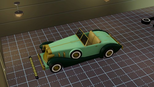
One of the primary things one can do with this car is work on the body, which causes it to get more and more repaired until finally, it can be driven. Working on the engine makes the engine work better, somewhat, but does not appear to really give the vehicle any speed. The vehicle itself is quite slow, making using it for transportation questionable (the taxi is faster), and using the vehicle for actual driving involves it acting like every other car in the game.
The main advantage is the car can act as a woo hoo spot. One can listen to the radio in it, sit in it with another sim, and woo hoo with another sim in it. Oh, and watch the stars in it. It’s also the only car in the game where sims can open the door to get in, but the door opening does not apply to any actual travel. Overall, nothing that makes the car actually worth the effort to get it fully working, making this more of a vehicle to fix up to sell.
Overall, it is a nice addition for the players who actually want it, but for most people it may not be worth the effort.

————————————————————————————————————————————-
The Boardwalk
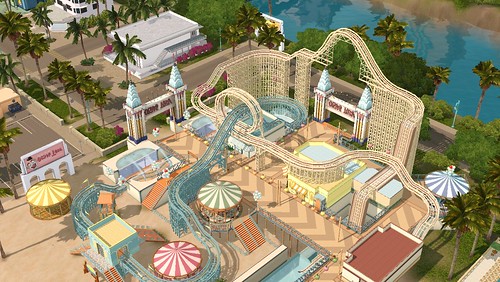
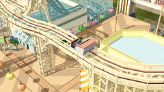
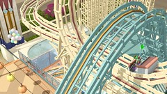
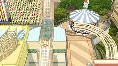
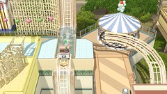
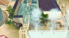
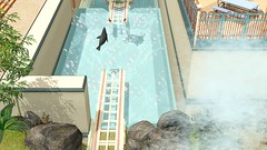
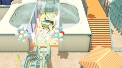
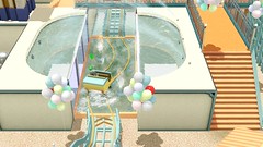
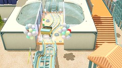
A venue that is intended to go with this world, the Boardwalk is primarily a roller coaster-oriented lot that allows sims to enjoy the thrills of riding an actual roller coaster. The lot does have shops for other things, fitting in with its theme, but the roller coasters are primarily what take center stage.
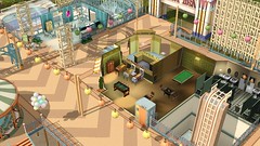
Just one note: If you go in-game and view the lot from overhead, it looks a bit like a pinball game. I find that a bit amusing, and definitely keeping in-theme.
While there are other activities, the roller coasters are the primary reason to visit. They can be set to one of three themes, with different pieces on the same track set to different themes, and each theme gives a moodlet to the sims who ride. The themes have minor animation and light differences to differentiate between them, but ultimately the ride is the same no matter what theme is chosen. The best part of the lot is the look on sims’ faces as they ride around the rails.
Ultimately, even if you don’t get the world, I recommend you buy this venue. It’s worth the purchase, just to enjoy what content it brings.


————————————————————————————————————————————-
Final Thoughts
I must admit I had some fun with this world. And I enjoyed some of the architecture as well. I also did not find it having many of the problems that ultimately made Bridgeport such of a nightmare for me.
However, I think fans of Bridgeport and those wanting a city world that isn’t Late Night-related are going to be vastly disappointed. One of the key items that makes cities unique for humans is that their core contains everything; you can meet all of your needs within a city without ever leaving its core area. Bridgeport was designed with this in mind, but Roaring Heights completely lacks that idea. The small size also makes the skyscrapers rather pointless, with the more tropical design of several areas actually making the art deco that dominates the center of Roaring Heights feel out of place. And, finally, many of the city world mechanics are simply missing, further adding to the complete lack of feeling like a city that Roaring Heights has.
Would I recommend it? If you love the theme, love the look of the world, or just want another world to play around with… buy it. If you want a city world, don’t waste your money.


