")
Now that we’ve tackled shape and proportion in Part 1, and the outline of our example house looks pretty house-like, let’s try coloring it!
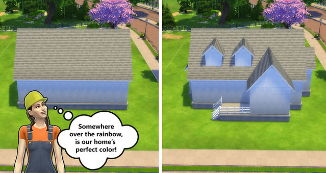
Let’s Start Coloring!
Instead of picking a color that looks pretty and slapping it on our house, let’s break it down a bit more and ask ourselves: What types of texture will look good on the exterior of the home? What colors will accent the home best? Where do we put these colors?
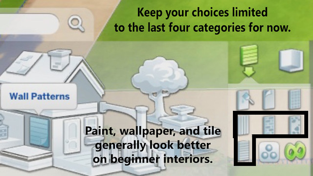
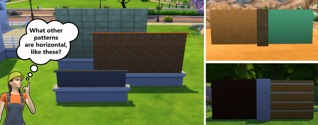
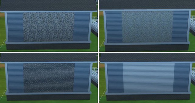
It’s All About that Base (Pattern)!
For a base material, pick a texture that looks supportive. To clarify, horizontal textures look like they can hold a lot of weight, and can be used on large areas in order to ground your structure.
For the base color, lean towards something that will stand out against your landscape. For example, if you’re surrounded by trees and a green lawn, it’s generally not a good idea to pick green as your base color.
Roof and Foundation Next!
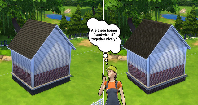
Once you have your base color, it’s time to pick your accent colors. First, don’t go for another wall pattern! Go for the roof and foundation. A lot of people forget that the default roof and foundation pattern may not be the best for their walls.
Keep the qualities of your main wall pattern in mind when choosing a roof pattern, and make the foundation color match the roof. This is an easy way to balance your build vertically. Think of your house as a sandwich, and the roof and foundation are your buns.
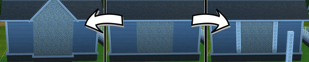
Add Another Wall Pattern!
For bigger homes, a second wall pattern is a great way of bringing an extra amount of detail and color into a wall. You can definitely skip this step if your house is small, because too many textures can overwhelm the overall look of the home.
If you pick a main color with mixed textures, like the paneling and brick combo, use either the full paneling or brick as the accent color. Otherwise, go with opposing details, but a similar color scheme. This tug-of-war between high contrast in texture is balanced by keeping the color scheme the same.
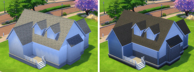
Put it All Together!
Let’s see how our example home looks after we follow the steps above. We chose a supportive wall pattern that stands out from the surrounding area, a roof that matches the tone of the walls, and a foundation that goes with the roof.
To Review:
- Pick a main wall pattern that looks supportive and a color that stands out from the surrounding area.
- Find a roof pattern that matches the qualities of your main wall pattern.
- Choose the foundation pattern that balances out the home vertically by matching the roof.
- If you’d like to add another accent wall pattern, choose one that goes with the color scheme, and put it in places where it’s easy to hide the transition.
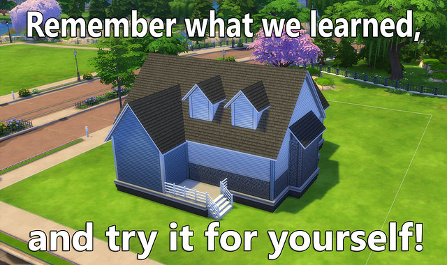
If this article was a bit wordy for you, take a look at the video below! Don’t forget to leave comments and ask questions!


")