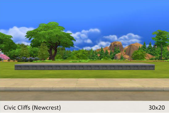
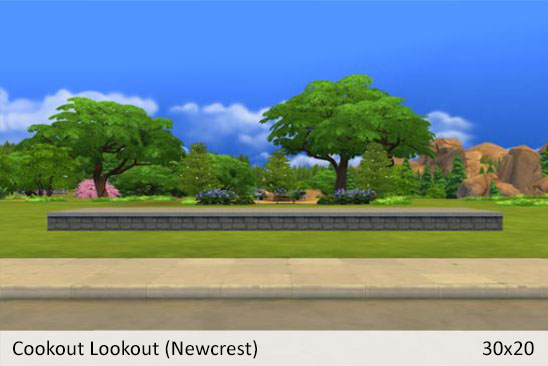
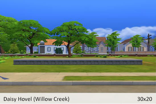
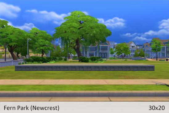
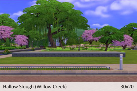
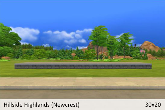
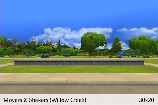
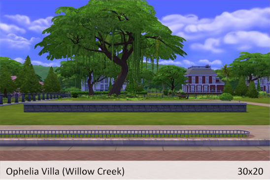
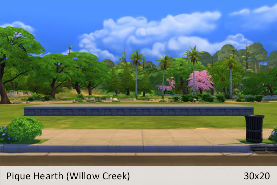
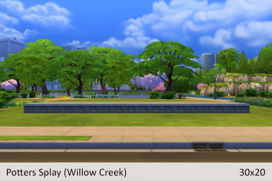
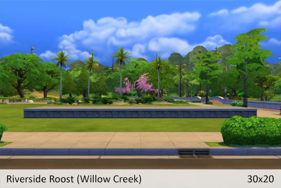
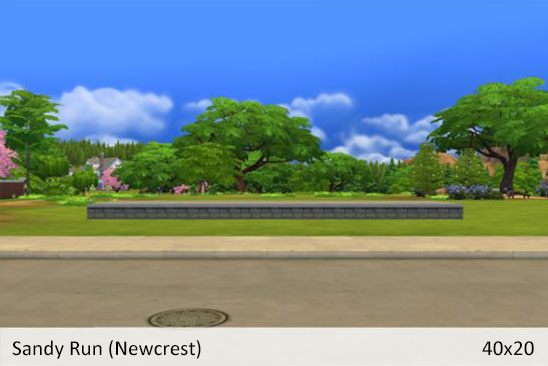
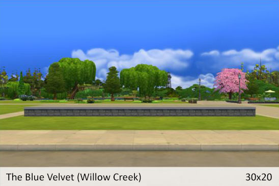
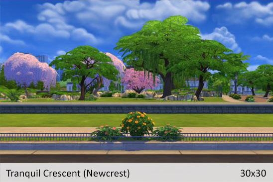
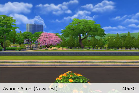
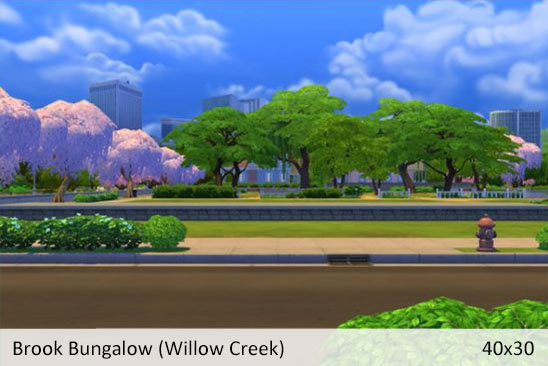
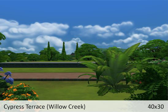
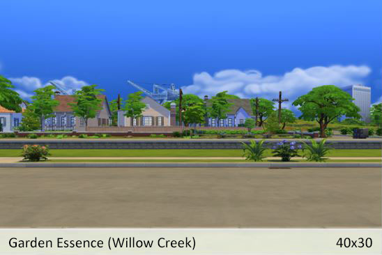
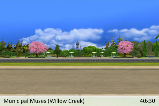
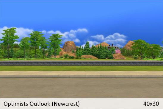
One of the biggest pains of sharing a build on the gallery are the default thumbnails. It is extremely frustrating to spend hours on a build and have the thumbnail not do your hard work justice. The team acknowledged this in the recent livestream and did give us a big hint (winky face) that custom thumbnails are in the works. So while we eagerly await the next update, I tried to think of ways to make the most of the default gallery thumbnails. What resource would I love to have and think other simmers might appreciate as well?
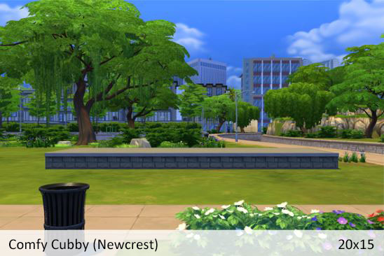
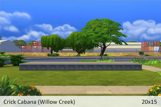
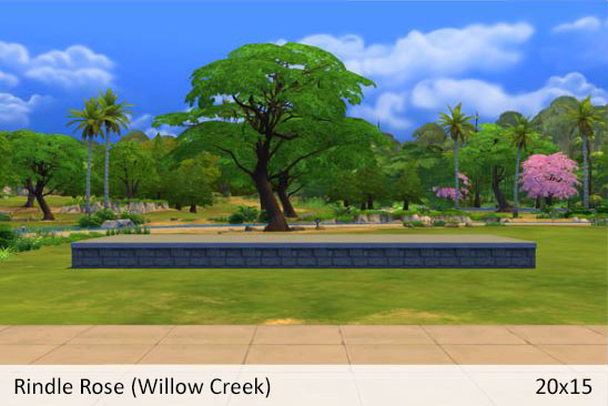
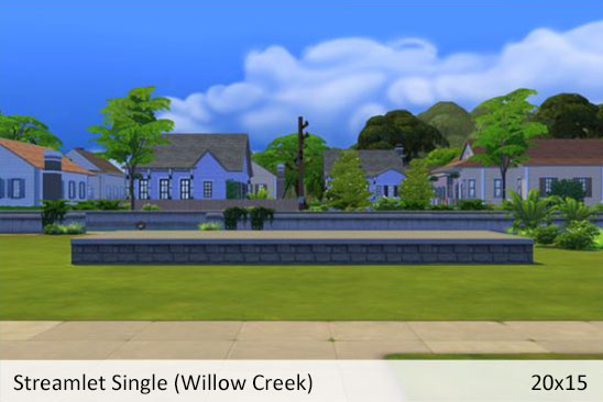
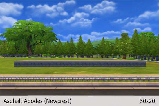
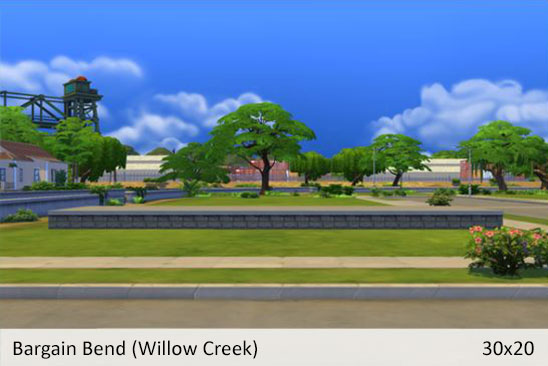
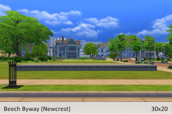
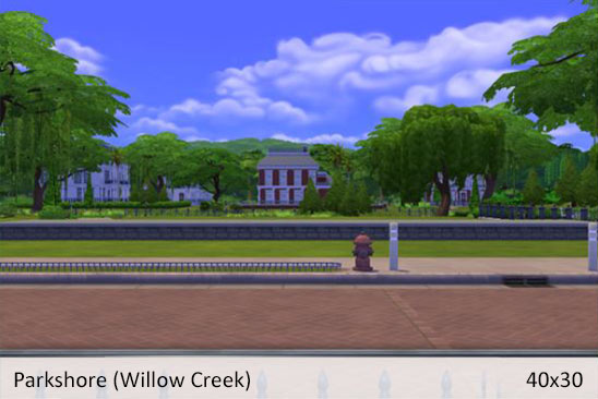
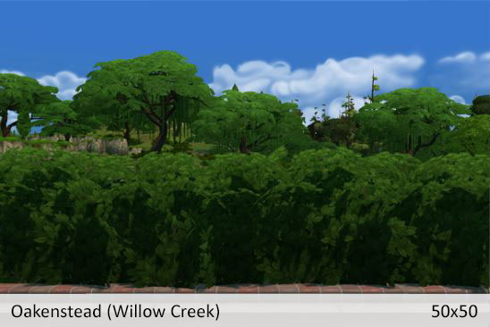
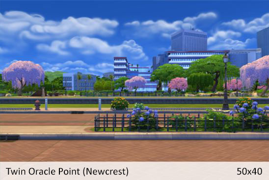
The conclusion I came to is I would love a visual guide of the default thumbnails. That way I could choose a background to compliment the build’s style and see if any objects in the environment obstruct the view. I quickly realized that with 10 neighborhoods that would be a very large tasks. Not to mention the visual differences based on time of day or season. So for a more manageable example, I stuck with just Willow Creek and Newcrest. (If you enjoy this post and would like me to put together a guide with more lots, let me know in the comments below.)
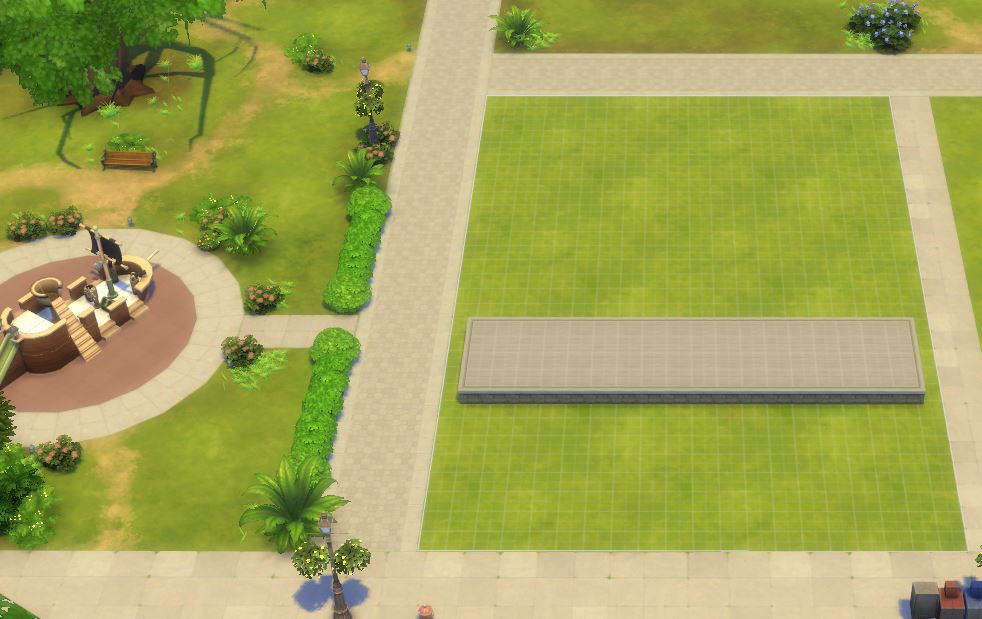
In the following examples you will see a basic foundation that is stretched to the max width of the lot. The foundation is placed 8 squares back from the front of the lot. I just wanted to put something there to give you a sense of how your build would appear in the gallery without hiding the background. You’ll notice some of the lots do cut off the edges of the foundation. You could make your build less wide or set it further back to counter this. The examples are also taken on a Summer afternoon so if you don’t own the Seasons expansion pack these examples would still work for you.
Small Lots | Medium Lots | Large Lots | Extra Large Lots
Small Lots
Medium Lots
Large Lots
Extra Large Lots
Edit: The Large and Extra Large Lots act a little differently based on the size of your build. So some of the objects you see in the foreground might not be noticeable. I’m working on capturing better examples.
Thank you for reading! Let me know in the comments if this was helpful. Do you have suggestions or requests for more lots you’d like to see? Happy Building!


